
clear2ooo
big letters
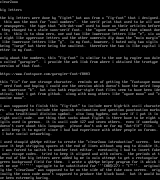
the big letters were done by figlet but was from a fig-font that i designed. this was the most for cool numbers. the serif print that used to be all over newspapers. the type that mlb-dot-com used to have on their articles before they changed to a stale sans-serif font. the agave mono nerd font almost does it. this is to show zero, one and two like lowercase letters like e, six and eight like uppercase letters and the other numerals dip down the main margin like lowercase letters like g. in my font, however, i hated only two sigils being large but three being the smallest. therefore the two is like capital letter in my font.
only about the numbers, this fig-font is similar to the one by rogier van dalen called garogier. i provide the web link from where i obtained the truetype version of that font.
https://www.fontspace.com/garogier-font-f8003
this fix for one strange character. reminds me of getting the fantasque mono nerd font and hoping i could use the version which doesnt have the weird loop on lowercase k. but alas both regular-style font files seem to have been identical, that i got from github. along with many others like agave mono and cousine mono.
i was supposed to finish this fig-font to include more high-bit ascii characters. i managed to include the spanish exclamation and question punctuation marks. also traditional division symbol. also long hyphen, not sure if i put it in right ascii code. one thing that sucks about figlet is there have to be eight sigils used in german. it is ascii code 127 and seven others. even if somebody doesnt care about this language. please dont ask me for my dot-flf file. i will keep it to myself since i had bad experience with other people on forums. i hate social networking.
i used stoopid qb64pe editor to create the clear2ooo introduction screen. because it kept stripping spaces at the end of lines without any way to disable it, i was forced to switch to another text editor. eventually i had to insert fake ansi escape codes. tried to keep it aligned and with colors. the periods at the end of the big letters were added by me in vain attempt to get a rectangular green background field for them. i wrote a qb64pe helper program for it which let me use squiggle to be substituted for CHR27 + . originally the clear2ooo was supposed to be on the side of the fake coco screen. originally the coco code wasnt supposed to produce the black band. but it would have been extremely boring.
big letters
the big letters were done by figlet but was from a fig-font that i designed. this was the most for cool numbers. the serif print that used to be all over newspapers. the type that mlb-dot-com used to have on their articles before they changed to a stale sans-serif font. the agave mono nerd font almost does it. this is to show zero, one and two like lowercase letters like e, six and eight like uppercase letters and the other numerals dip down the main margin like lowercase letters like g. in my font, however, i hated only two sigils being large but three being the smallest. therefore the two is like capital letter in my font.
only about the numbers, this fig-font is similar to the one by rogier van dalen called garogier. i provide the web link from where i obtained the truetype version of that font.
https://www.fontspace.com/garogier-font-f8003
this fix for one strange character. reminds me of getting the fantasque mono nerd font and hoping i could use the version which doesnt have the weird loop on lowercase k. but alas both regular-style font files seem to have been identical, that i got from github. along with many others like agave mono and cousine mono.
i was supposed to finish this fig-font to include more high-bit ascii characters. i managed to include the spanish exclamation and question punctuation marks. also traditional division symbol. also long hyphen, not sure if i put it in right ascii code. one thing that sucks about figlet is there have to be eight sigils used in german. it is ascii code 127 and seven others. even if somebody doesnt care about this language. please dont ask me for my dot-flf file. i will keep it to myself since i had bad experience with other people on forums. i hate social networking.
i used stoopid qb64pe editor to create the clear2ooo introduction screen. because it kept stripping spaces at the end of lines without any way to disable it, i was forced to switch to another text editor. eventually i had to insert fake ansi escape codes. tried to keep it aligned and with colors. the periods at the end of the big letters were added by me in vain attempt to get a rectangular green background field for them. i wrote a qb64pe helper program for it which let me use squiggle to be substituted for CHR27 + . originally the clear2ooo was supposed to be on the side of the fake coco screen. originally the coco code wasnt supposed to produce the black band. but it would have been extremely boring.
log in to add a comment.